
This seems like a good time to share them, so that other people can make overly-detailed, cramped UIs so that mine look ordinary by comparison. The files can be downloaded from my Google Drive (links as the end).
Newest files first, then the archive of the pre Version 1.0.7 material (yep, I've been using Decent Sampler for quite a long time!)
Latest files
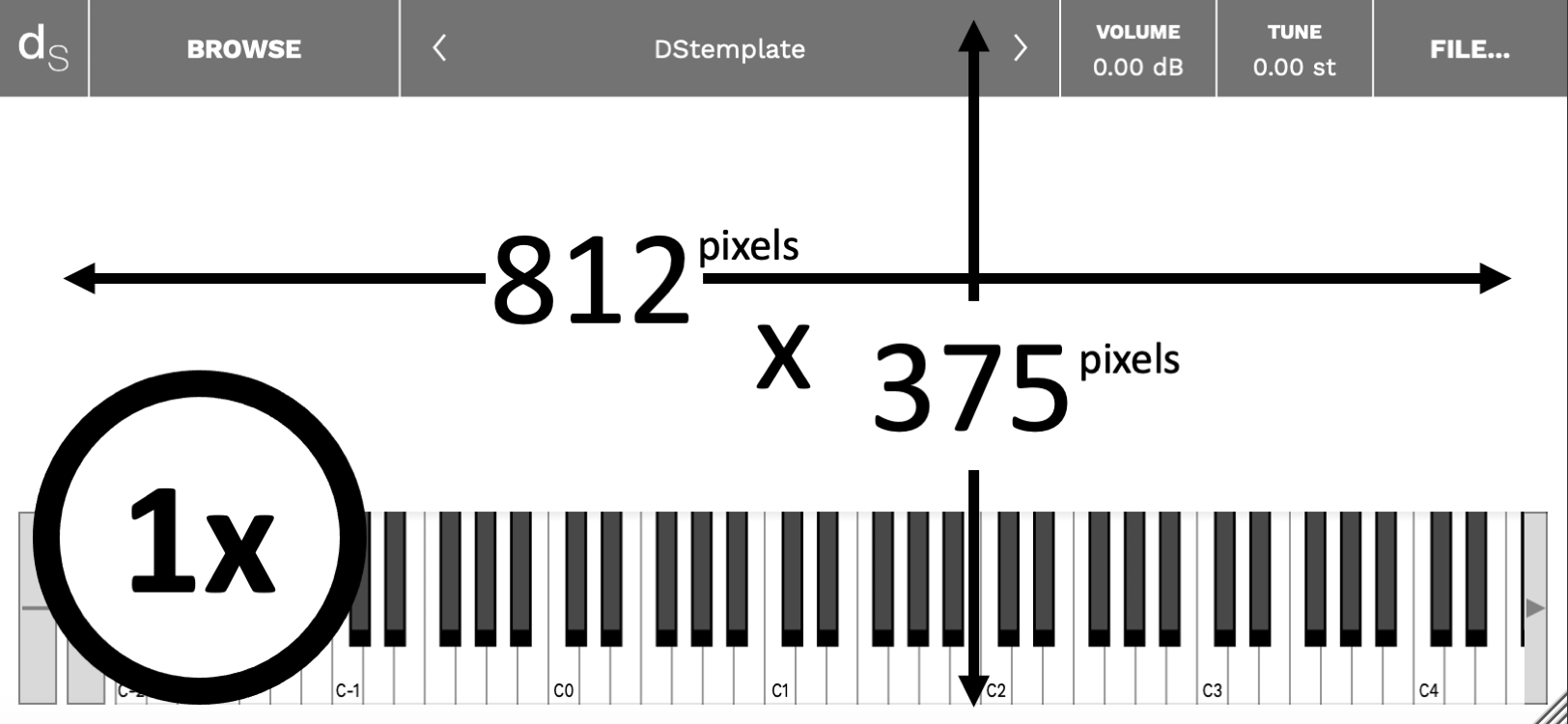
Background first. A .jpg or .png. A photo, or artwork. (Trying to get a moving background with a .gif is pointless, by the way, as are .mp4 videos!) So 812 x 375 is the space you have to work with, but note all that screen furniture that will obscure your artwork or photograph excellence. The '1x' is a clue that you can prepare your graphics either at 1:1, or at double size (1824 x 750) - Decent Sampler will adapt accordingly.

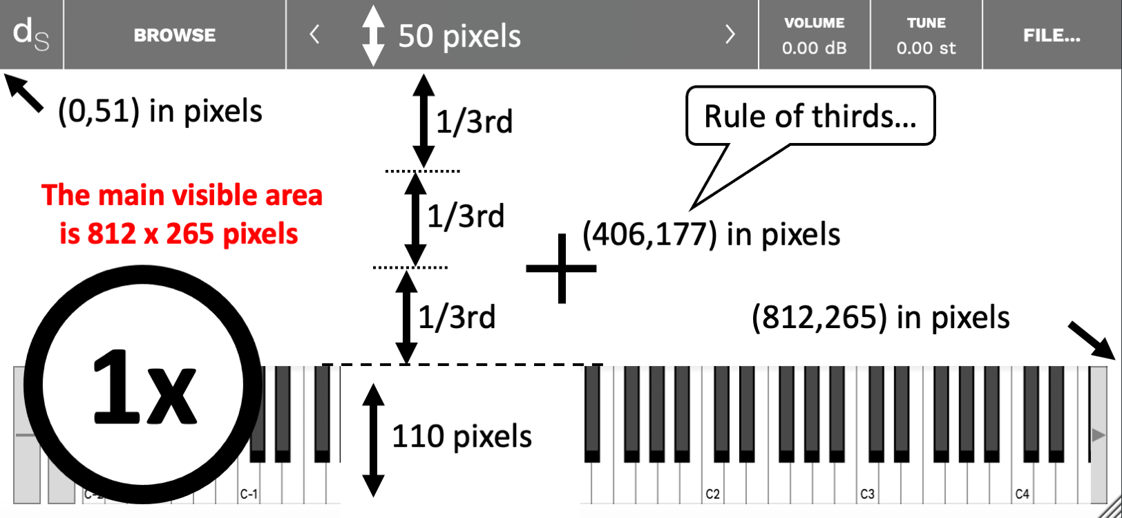
Probably the most important thing when preparing your graphics or photo is that cross in the middle. The centre (center) of the visible area is at 406,158 - so that's where your should put your main focus if you want it in the obvious place. Alternatively, if you are into 'placement in photos should split the area into thirds', then you should put it at 812, 177, nineteen pixels lower, because that's two thirds of the way down the visible area.
One place to avoid is when you split the whole 812 x 375 into thirds, because then it will be at 812, 250, which is only just above the keyboard. It feels more than a little cramped to me...
The Google drive folder contains additional files to make things easier: blank 1x and 2x .pngs, masks for the top bar and the keyboard in a variety of colours, plus alpha (is that a colour, or not?), and some fascinating examples where I have adjusted the levels to reveal some unwanted artefacts that are present in the Decent Sampler graphics. Probably for uber-geeks only, that stuff...
User Interface
There are two bits of graphics to consider. The background can be prepped in your favourite photo editor (Graphics Converter for me), but the UI is specified in Decent Sampler's .dspreset file, and is XML code that places little bit of user interface (rotary controls, etc.) in the right place.
Finding the right place for little bit of user interface is vital. You need a starting point first. Somewhere that you and Decent Sampler both know and agree is the corner of the universe. (When I was a kid, I lived only a couple of miles away from a place that was known locally as 'The Centre Of The Universe', so trust me, I know what I'm talking about!) Decent Sampler knows this point as (0,0), and it is just under the top bar, on the far left. Note that the actual top of the background graphics that you made earlier with the help of the diagrams above, is at 0,-50, and is hidden by the top bar. Try putting user interface bits there and you won't see them...

Whilst I'm distracted by thinking of Spitfire Audio, I would like to put in a good word for Polaris, their 'orchestra/synth' melange that I rather like (Er, would it be too much for a 'Wow'! here?), but then I've always like synthesizers and processed audio, and so this joins their other BT project, Phobos' as two of my favourite virtual instruments. Take a look:
Spitifre Audio Polaris

The box is the keyboard position. The keyboard does not seem to be semi-transparent, so there's no real point in putting graphics underneath it!

Decent Sampler's zero, zero, (epoch, starting point,...) is in the left corner, just below the top bar. The top bar is 50 pixels tall, but Decent Sampler knows this point as (0,0). So the actual top (hidden by the top bar) is at 0,-50). Try putting graphics there and you won't see them...
Note that you only have 812 x 214 UI Units to play with. I could call them 'pixels', but I'm going to use 'UI Units' since that makes them distinct from the pixels of the background image. For User Interfaces, then I think that the graphics should not be laid out in thirds, I prefer to use halves, and so this time, the actual centre is useful, and it is at 406, 107 in UI Units. If this was an analogue synthesizer, then that is where I would like to have the Cutoff Frequency control for the Resonant Ladder Low-Pass Filter, and in Decent Sampler, then your nearest equivalent might be the low-pass filter cutoff frequency, but the Expression control might be a close contender.
For a 'Spitfire Audio' look, you could always nudge your main control across to the right a little bit - this is where they put their 'big rotary control' bit:
 |
| Spitfire Audio's User Interface (a tiny part of it) for Polaris... |
Whilst I'm distracted by thinking of Spitfire Audio, I would like to put in a good word for Polaris, their 'orchestra/synth' melange that I rather like (Er, would it be too much for a 'Wow'! here?), but then I've always like synthesizers and processed audio, and so this joins their other BT project, Phobos' as two of my favourite virtual instruments. Take a look:
Spitifre Audio Polaris
All thoroughly recommended!
But back to User Interface thoughts. Here's a couple of diagrams showing one way to split up that 812 x 214 are into useful divisions:
 |
| Horizontal divisions... |
 |
| Vertical divisions... |
Again, and you already knew this, there are more files on the Google Drive, including ones that show how to derive these divisions. Here's the download link:
Tips
The biggest tip I can give for Decent Sampler is to use <control> and <label> elements instead of the <labelled-knob> element. Using <control> and <label> elements gives you much more precision and flexibility with the placement of the labels with respect to the control bit, so you have much more 'control' over how your UI looks and 'feels'. I haven't used a <labelled-knob> for a long time!
Tying together the background graphics and the User Interface bits is also a good idea. They should work together, not pull in two different directions. Recently, I have been playing with splitting the UI into sections by using dark and light areas of background:
 |
| The 'slightly busy' UI for 'Cyclic Transpositions 01... |
Note that you can see the background purple graphics underneath the top bar, as well as in the border of the keyboard.
---
Pre 1.0.7
Yep, not unlike Russian Doll Season 2, but this isn't quite a jump into the 1980s...
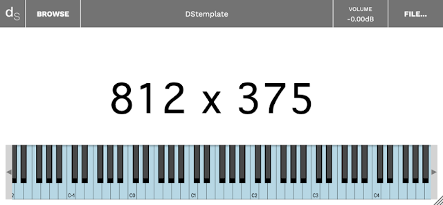
First off, there are some sized graphics files, in 2x (1624 x 750 pixels) and 1x (812 x 375 pixels):

These deliberately show the on-screen 'chrome' or 'UI furniture': the top bar and the keyboard, because these are areas that you will want to avoid with your background graphics.
---
Then there are the 'magic numbers' that aren't in any of the format documentation (as far as I could see, anyway):

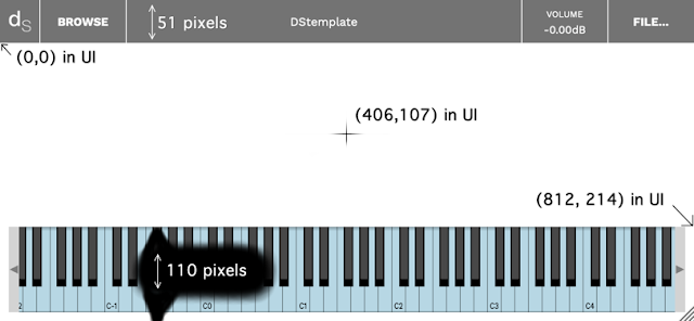
Yep, the top bar is 51 pixels high, and the keyboard (plus the border) is 110 pixels high. They are both 812 pixels wide.
The zero, zero 'epoch' position for the graphics inside Decent Sampler is not the top- left hand corner! it is 51 pixels lower...
The centre of the UI screen is at 406,107.
The far right hand lower corner is at 812, 214 (just above the keyboard). So your UI graphics have to fit into a rectangular area that is 812 x 214, although the border around the keyboard and underneath the semi-transparent top bar means that some of your graphics outside this area will be visible.
---
Then there are plain white, precisely sized files that can be used as starting points, again in 2x (1624 x 750 pixels) and 1x (812 x 375 pixels):

The box is the keyboard position. The keyboard does not seem to be semi-transparent, so there's no real point in putting graphics underneath it!
---
 Buy me a coffee (Encourage me to write more posts like this one!)... or...
 (Encourage me via a different route entirely...)
Decent Sampler scales graphics files (.png and .jpg files) that are larger that the default 812 x 375, so you can use 2x or larger if you want. This just increases the size of your sample pack and download time (ever so slightly!).
---
Alongside these graphics files, it may also be worth creating some .dspreset 'template' XML files if you intend to do a UI once, and then publish multiple variants of it with different samples and graphics.
---
The download area:
---
If you find my writing helpful, informative or entertaining, then please consider visiting this link:
Synthesizerwriter's Store (New 'Modular thinking' designs now available!)
Or just tell someone else that there's this amazing blog about hi-tech music...


No comments:
Post a Comment