Monday 25 April 2022

Some Templates for Decent Sampler Background Graphics Creation

When Decent Sampler first appeared, I created some graphics template files to help me create the background graphics for the User Interfaces (UI) that I am now notorious for... (Oh, and as a bonus, you get lots of helpful hints for the UI design as well. Double value today!)

This seems like a good time to share them, so that other people can make overly-detailed, cramped UIs so that mine look ordinary by comparison. The files can be downloaded from my Google Drive (links as the end).

Newest files first, then the archive of the pre Version 1.0.7 material (yep, I've been using Decent Sampler for quite a long time!)

Latest files


Background first. A .jpg or .png. A photo, or artwork. (Trying to get a moving background with a .gif is pointless, by the way, as are .mp4 videos!) So 812 x 375 is the space you have to work with, but note all that screen furniture that will obscure your artwork or photograph excellence. The '1x' is a clue that you can prepare your graphics either at 1:1, or at double size (1824 x 750) - Decent Sampler will adapt accordingly.


The top bar is 50 pixels tall, and the keyboard area at the bottom of the window is 110 pixles high. This gives a visible area of 812 x 265 pixels, plus a little border around the keyboard, pitch bend and mod wheels, and tiny little slivers in between those areas on the top bar. Oh, and the top bar is not totally opaque, so you will be able to see some of your graphics there, but not very clearly. 


Probably the most important thing when preparing your graphics or photo is that cross in the middle. The centre (center) of the visible area is at 406,158 - so that's where your should put your main focus if you want it in the obvious place. Alternatively, if you are into 'placement in photos should split the area into thirds', then you should put it at 812, 177, nineteen pixels lower, because that's two thirds of the way down the visible area. 

One place to avoid is when you split the whole 812 x 375 into thirds, because then it will be at 812, 250, which is only just above the keyboard. It feels more than a little cramped to me...

The Google drive folder contains additional files to make things easier: blank 1x and 2x .pngs, masks for the top bar and the keyboard in a variety of colours, plus alpha (is that a colour, or not?), and some fascinating examples where I have adjusted the levels to reveal some unwanted artefacts that are present in the Decent Sampler graphics. Probably for uber-geeks only, that stuff... 

User Interface


There are two bits of graphics to consider. The background can be prepped in your favourite photo editor (Graphics Converter for me), but the UI is specified in Decent Sampler's .dspreset file, and is XML code that places little bit of user interface (rotary controls, etc.) in the right place. 

Finding the right place for little bit of user interface is vital. You need a starting point first. Somewhere that you and Decent Sampler both know and agree is the corner of the universe. (When I was a kid, I lived only a couple of miles away from a place that was known locally as 'The Centre Of The Universe', so trust me, I know what I'm talking about!) Decent Sampler knows this point as (0,0), and it is just under the top bar, on the far left. Note that the actual top of the background graphics that you made earlier with the help of the diagrams above, is at 0,-50, and is hidden by the top bar. Try putting user interface bits there and you won't see them...


Decent Sampler's zero, zero, (epoch, starting point,...) is in the left corner, just below the top bar. The top bar is 50 pixels tall, but Decent Sampler knows this point as (0,0). So the actual top (hidden by the top bar) is at 0,-50). Try putting graphics there and you won't see them...

Note that you only have 812 x 214 UI Units to play with. I could call them 'pixels', but I'm going to use 'UI Units' since that makes them distinct from the pixels of the background image. For User Interfaces, then I think that the graphics should not be laid out in thirds, I prefer to use halves, and so this time, the actual centre is useful, and it is at 406, 107 in UI Units. If this was an analogue synthesizer, then that is where I would like to have the Cutoff Frequency control for the Resonant Ladder Low-Pass Filter, and in Decent Sampler, then your nearest equivalent might be the low-pass filter cutoff frequency, but the Expression control might be a close contender. 

For a 'Spitfire Audio' look, you could always nudge your main control across to the right a little bit - this is where they put their 'big rotary control' bit:

Spitfire Audio's User Interface (a tiny part of it) for Polaris...

Whilst I'm distracted by thinking of Spitfire Audio, I would like to put in a good word for Polaris, their 'orchestra/synth' melange that I rather like (Er, would it be too much for a 'Wow'! here?), but then I've always like synthesizers and processed audio, and so this joins their other BT project, Phobos' as two of my favourite virtual instruments. Take a look:

Spitifre Audio Polaris


All thoroughly recommended!

But back to User Interface thoughts. Here's a couple of diagrams showing one way to split up that 812 x 214 are into useful divisions:

Horizontal divisions...

Vertical divisions...

Again, and you already knew this, there are more files on the Google Drive, including ones that show how to derive these divisions. Here's the download link:

Tips

The biggest tip I can give for Decent Sampler is to use <control> and <label> elements instead of the <labelled-knob> element. Using <control> and <label> elements gives you much more precision and flexibility with the placement of the labels with respect to the control bit, so you have much more 'control' over how your UI looks and 'feels'. I haven't used a <labelled-knob> for a long time!

Tying together the background graphics and the User Interface bits is also a good idea. They should work together, not pull in two different directions. Recently, I have been playing with splitting the UI into sections by using dark and light areas of background:

The 'slightly busy' UI for 'Cyclic Transpositions 01...

Note that you can see the background purple graphics underneath the top bar, as well as in the border of the keyboard. 

---

Pre 1.0.7

Yep, not unlike Russian Doll Season 2, but this isn't quite a jump into the 1980s...

First off, there are some sized graphics files, in 2x (1624 x 750 pixels) and 1x (812 x 375 pixels):


These deliberately show the on-screen 'chrome' or 'UI furniture': the top bar and the keyboard, because these are areas that you will want to avoid with your background graphics.

---

Then there are the 'magic numbers' that aren't in any of the format documentation (as far as I could see, anyway):


Yep, the top bar is 51 pixels high, and the keyboard (plus the border) is 110 pixels high. They are both 812 pixels wide.

The zero, zero 'epoch' position for the graphics inside Decent Sampler is not the top- left hand corner! it is 51 pixels lower... 

The centre of the UI screen is at 406,107.

The far right hand lower corner is at 812, 214 (just above the keyboard). So your UI graphics have to fit into a rectangular area that is 812 x 214, although the border around the keyboard and underneath the semi-transparent top bar means that some of your graphics outside this area will be visible. 

---

Then there are plain white, precisely sized files that can be used as starting points, again in 2x (1624 x 750 pixels) and 1x (812 x 375 pixels):


The box is the keyboard position. The keyboard does not seem to be semi-transparent, so there's no real  point in putting graphics underneath it!

--- 

Decent Sampler scales graphics files (.png and .jpg files) that are larger that the default 812 x 375, so you can use 2x or larger if you want. This just increases the size of your sample pack and download time (ever so slightly!). 

---

Alongside these graphics files, it may also be worth creating some .dspreset 'template' XML files if you intend to do a UI once, and then publish multiple variants of it with different samples and graphics. 

---

The download area:


---

If you find my writing helpful, informative or entertaining, then please consider visiting this link:

Synthesizerwriter's Store (New 'Modular thinking' designs now available!)

Buy me a coffeeBuy me a coffee (Encourage me to write more posts like this one!)... or...

Buy Me a Coffee at ko-fi.com (Encourage me via a different route entirely...)

Or just tell someone else that there's this amazing blog about hi-tech music...


Sunday 24 April 2022

A Decent Sampler Translation Table Cookbook...

Decent Sampler is slightly more than just a sample player. There are hidden depths if you go looking, and regular readers will know that I love deep products! So here are some hints, tips and ideas for getting the most out of the Translation Tables!

Translation Tables

Yes, I know, they aren't exactly going to be headline news, but there'a a lot that you can do with them.

The Power_Curve Spreadsheet

First off, I'm going to mention my newly updated spreadsheet (.xlsx and .ods versions are available) for creating exponential / power law curves instead of the default linear mapping that Decent Sampler uses:

The default settings are aimed at one of the first things that you will probably want to 'fix' with a translation table: the mapping between the control (slider, rotary...) and the values! At the low end, the control of cut-off frequency for the low-pass filter is a little bit abrupt - you can suddenly get loud sounds when you were not expecting them, especially when the Q control is set high. So the default curve takes about half of the travel of the control (slider, rotary) to get from 10 Hertz to 635 Hertz, which is a lot of low-end precision. The other half then goes from 635 Hz to 22kHz, which feels okay to my fingers.

The spreadsheet doesn't have any instructions, so here's a quick explanation of one way of working with it. 

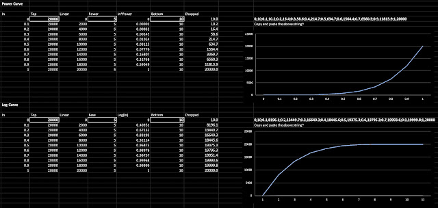
The Power_curve spreadsheet

Start by setting the limits. 

Set 'Top' to the highest value you want to control - for the low-pass filter this will be 22kHz, so put '22000' into the 'Top' box. 

Then set 'Bottom' to the lowest value you want to control - for the low-pass filter this is 20Hz, so put '20' into the 'Bottom' box. 

You now need to choose the 'Power/Base' setting - putting '1' into the 'Power/Base' box will give a straight line, which is the default in Decent Sampler. Putting higher values into the 'Power/Base' box will make the curve more and more 'boomerang shaped (the bend in the curve will get more and more extreme!). The default value of '5' may be too much for you - I actually think that '3' is a good starting point for you to find what suits your fingers and your UI (rotary and slider controls feel different with different 'Power/Base' settings...).  

Note that a Power curve puts more detail at the lower end of the control's range, whilst a Log curve puts more detail at the higher end. 

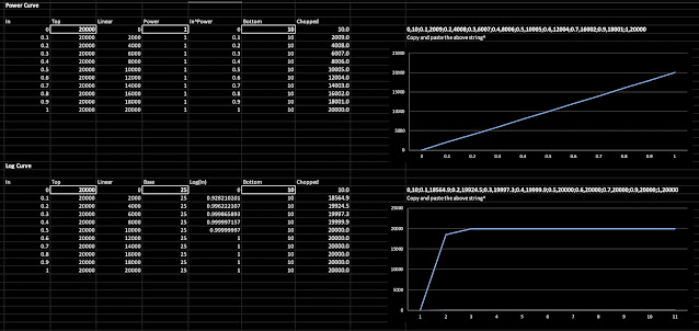
The extreme values of 'Power/Base'...

Here are the limits to the curves: Power/Base set to 1 gives a straight line, whilst 25 gives a very abrupt corner! You can really see the piecewise linear approximations (straight lines) for the log curve. 

Once you have a curve that seems right, just copy and paste the long string of numbers above the graph and paste it into the translation table definition:

translationTable="0,10;0.1,10.2;0.2,16.4;0.3,58.6;0.4,214.7;0.5,634.7;
0.6,1564.4;0.7,6560.3;0.9,11813.9;1,20000"

Here's an example 'binding' that you might use inside a <control> element:

<binding
type="effect"
level="instrument"
position="0"
parameter="FX_FILTER_FREQUENCY"
translation="table"
translationTable="0,10;0.1,10.2;0.2,16.4;0.3,58.6;0.4,214.7;0.5,634.7;
0.6,1564.4;0.7,6560.3;0.9,11813.9;1,20000"
/>

Controlling Volume

Changing the 'feel' of rotary or slider controls isn't the only thing you can use Translation Tables for... Because you can put more than one <binding> element inside a <control> element, then you can make controls that do more than one thing at once!

One typical use would be to mix between two different sounds - you could have a sustained sample and a percussive sample, and you want to be able to give the user a continuous control of the mix between the two samples. Now you could use two separate controls to do this, but a single mix control is much neater, and if you make it a horizontal slider, then you could do a DJ Controller background...


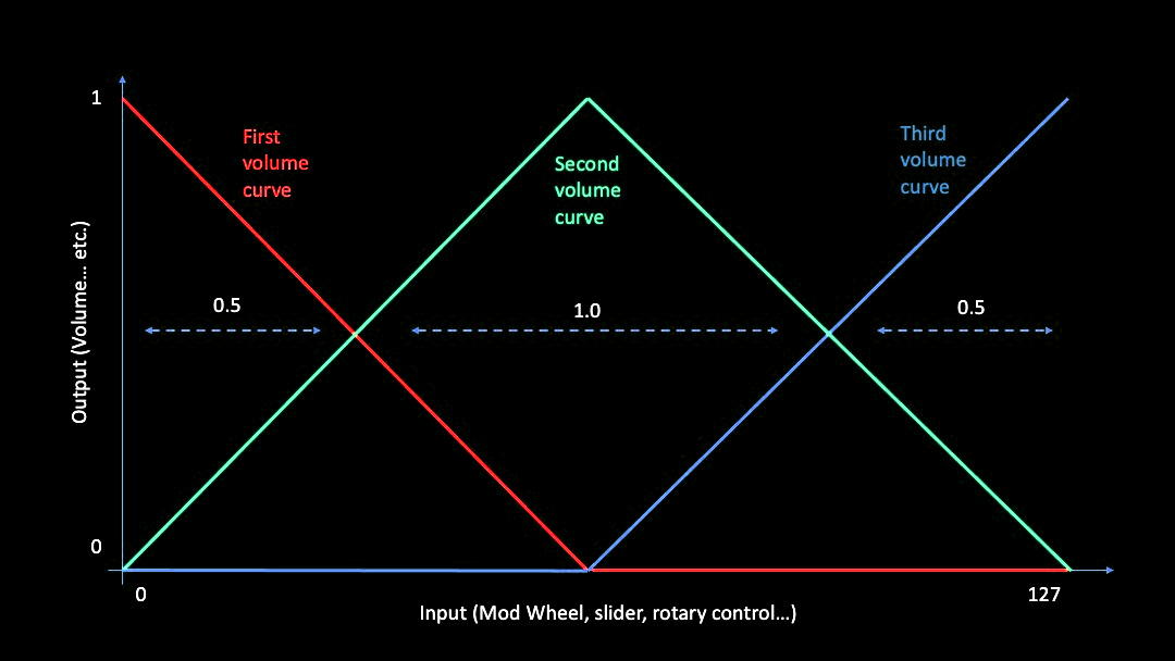
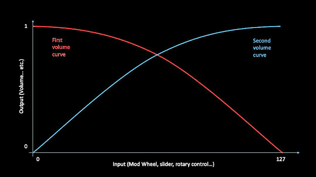
The simplest way of doing a mix control would be to have two opposite tables, as shown above. 

The 'Second Volume Curve' is a straight line, but think of it as a curve that is straight rather than curvy... and it looks just like the linear table shown above. You can specify a table like this with just two points: one at the beginning and one at the end. This 'curve' starts out at zero (silence) and goes up to 1 (full volume) as the input controller moves from 0 to 127 (on a MIDI Mod Wheel, but it could also be 1 for a rotary or slider control...or any other value you define in the table...). 

In the diagrams, I have shown a Mod Wheel as the controller, so the minimum and maximum values are 0 and 127, but in the text I have used 0 and 1 as the controller values, because this is a more generic example.  

The 'First Volume Curve' is another straight line, but going the opposite way. So the volume starts out at maximum and ends up at silence as the input controller moves from 0 to 1 (or 127, or...). So one volume does the opposite of the other. In Decent Sampler, this is just two <binding> elements inside a <control>:

<control x="195" y="30" parameterName="Mix" type="float"
minValue="0.001" maxValue="1.0" value="0.8"
trackForegroundColor="FFFF7700" trackBackgroundColor="FF000000"
width="30" height="180" style="linear_vertical" >
<binding type="amp" level="tag" identifier="0" parameter="TAG_VOLUME"
translation="table" translationTable="0,1;0.5,0;1,0" />
<binding type="amp" level="tag" identifier="1" parameter="TAG_VOLUME"
translation="table" translationTable="0,0;0.5,1;1,0" />
</control>

In this example, the two 'TAG-VOLUME's will affect the volume of the '0' and the '1' tagged groups in the Decent Sampler XML file... But you could also use tags and AMP_VOLUME if you prefer:

<binding type="amp" level="group" position="0" parameter="AMP_VOLUME" ...table1... />
<binding type="amp" level="group" position="1" parameter="AMP_VOLUME" ...table2... />

The two important bits here are the two Translation Tables:

translationTable="0,1;0.5,0.5;1,0"

translationTable="0,0;0.5,0.5;1,1"

The top table starts at 1 and drops to 0, whilst the bottom table starts at 0 and rises to 1. The middle position is 0.5, and this is where things get a little bit tricky. As you move the input control, the 'volume'  that you hear might not stay constant, and it might sound like it gets quieter, or louder, in the middle. It depends on how the volume is controlled (linear, logarithmic or other), and sometimes even the samples themselves - in the example I mentioned at the beginning, then the percussive sample is probably going to sound quieter than the sustained sample, and so even if the volume that you might see in a DAW or audio editor says that they have the same peak volume, when you mix between them it could sound strange. But this is why you have detailed control over the translation tables! 

The general case is probably going to be that you will need two curves instead of straight lines, perhaps something like the ones shown above. The easiest way to do this is to use those straight line approximations again:

translationTable="0,1;0.5,0.66;1,0"

translationTable="0,0;0.5,0.66;1,1"

So now the half-way setting of the input is going to output 2/3rds of the percussive and the sustained samples, instead of half volume. As I said, the exact value will depend on the samples and your preferences - Virtual Instruments are very context-sensitive!

The 'Arbitrary_curve' spreadsheet is another utility that helps to design volume curves...

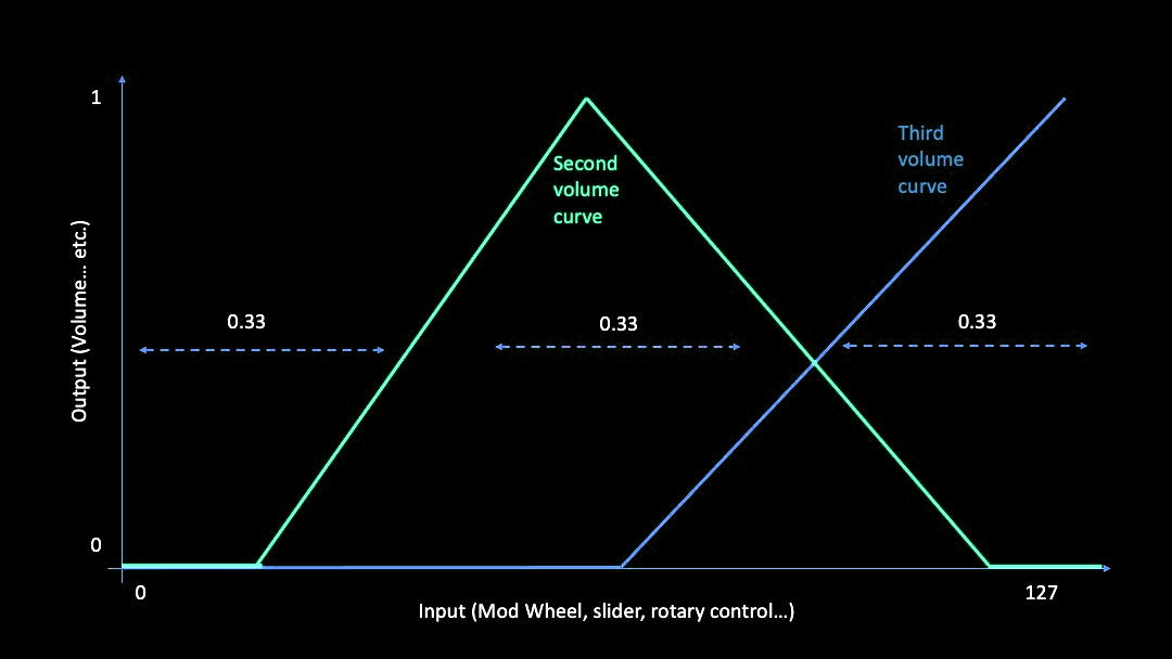
You may have realised that there's a potential problem with the mix control - it always makes a sound! What might be lots more useful (and interesting) would be a mix control that starts out at zero volume, then raises the volume of the sustained sample, and then mixes in the percussive sample whilst dropping the sustained sample, so half way would be a mix of the two sounds, and ending up with just the percussive sample at the end of the mix control's movement. This time, the curves are very different in the zero position (and I have deliberately renamed them to second and third):

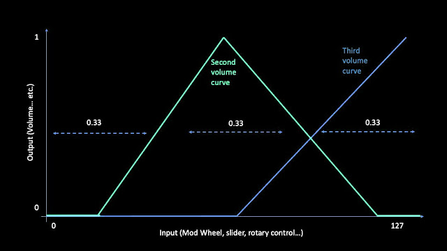
At the zero position, the volume for both samples needs to be zero. As the input value rises, the sustained sample gets louder and louder, and at half way it is at full volume. Notice that the percussive (third volume curve)  doesn't start until slightly later, so that there is a 'dead zone' around the half-way point where you hear just the sustained sample. From half way to just below the maximum input control position, the sustained sample fades out as the percussive sample fade up. There is another 'dead zone' at maximum input where just the percussive sample is heard. 

<binding ... translationTable="0,1;0.2,0.5;1.0;0,0.66,0.5;0.95,0;1,0" />

<binding ... translationTable="0,0;0.55,0;0.66,0.5;1,1" />


And the curvy version is shown above - just more pairs of values in the translation table.


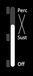
The UI might look something like the above draft graphics... And here is exactly this type of sustain-percussive slider in use:


Now it may have occurred to you that the UI graphics above are actually a three-way mixer, except one of the positions is zero volume (and no sample). If we replace the zero volume with a third sample then we have a single rotary or slider control that fades between three different samples:

 
A simple form is shown above. I've not put in the dead zones that would probably be useful in a real implementation, because I wanted to show the basic form of a three-way volume control on a single rotary or slider control. This time there are three tables:

translationTable="0,1;0.25,0.5;0.5;0,0.75,0.0;1,0"
translationTable="0,0;0.25,0.5;0.5,1;0.75,0.5;1,0"
translationTable="0,0;0.25,0.0;0.5,0;0.75,0.5;1,1"


Turning this into the 'curvy' form reveals something that wasn't as significant in the sustain/percussive mixer - the middle section is too big: it is twice as big as the sections either side of it (0.5, 1.0, 0.5 in the diagram above - and yes, I know it should have been 0.25, 0.5, 0.25, but this seems to obscure things rather than making them clearer!)

translationTable="0,1;0.33,0.66;0.5;0,0.66,0.0 ;1,0"
translationTable="0,0;0.33,0.66;0.5,1;0.66,0.66;1,0"
translationTable="0,0;0.0 ,0.0 ;0.5,0;0.66,0.66;1,1"


So, using 0.33 and 0.66 as the two places where the mixing is 0.5, gives us a different curvy form. The rotary or slider control is now split into 3 zones: one for each sample. Note that this is not a full 3-way mixer: it only fades between sample 1 and 2, or 2 and 3. It isn't possible to fade between 1 and 3, because there isn't anywhere on the control that goes there! 

(I leave it as an exercise to see if you can figure out a way to provide a fade between 1 and 3... It isn't pretty, but it is possible...)

This means that the samples need to be carefully chosen, so that the user never wants to use the missing fade! One possible approach might be to have the Sustain sample in the middle (2), the Percussive sample at the top (3), and some sort of Noisy sample that complements the sustain sample at the bottom (1). This way the middle position is the default, with the user moving the control up to get a more percussive sound, and moving the control downwards to roughen up the sustain sound with noise.

There is a catch, of course. Having a single control for sustain and percussive sounds means that we can adjust the mix between them, but not the overall volume. Of course, if those are the only sounds that we are using then an Expression pedal or control could be used to alter the overall volume. But if we wanted to control the balance between two pairs of sustain/percussive sounds, then expanding things out to 4 separate volume controls is probably the best option. As someone who is notorious for having complex user interfaces (UIs), then please forgive me when I try to explore other, more 'compact'  options. Maybe there is a case for doing different UIs for different end uses...

Finally, before thinking about the next level, consider current high-end stage pianos - Nord Stage 3, Yamaha CP88, Roland RD-2000 et al. The reason they have lots of controls is because of the complexity of balancing piano with strings, pads, etc. in a modern 'gigging' context. Then think back 70 years and consider the controls on a (Fender-)Rhodes Mark 1 Stage Piano - only two rotary controls and effectively only one (very expressive) sound (although if you added an MXR Phase 90...). Times have changed!

Further extensions

The samples need not be conventional samples, they could also be release samples triggered by 'Note Off' MIDI messages, or even one of those large pools of legato samples. 

Now that I have shown you the way to move from two samples to three, you have probably realised that this can be extended to as many samples as you want, although don't forget that squashing too many samples onto a small rotary or linear control might overwhelm the end user! (It also gets harder to choose an ordering of samples that makes the limited number of available fades feel like they are the right ones, and you don't get users asking how they fade between samples in different parts of the control...)

Once you have got your head around Translation Tables, then you can do a lot with them. I have just been scratching the surface in this blog post...

The important thing is that Translation Tables are one way to achieve sophisticated user control over multiple samples, without a huge amount of complexity being required 'behind the scenes'. Anything that makes creating Decent Sampler virtual instruments easier is good in my book, and I hope that this blog post has opened up some new possibilities for your Decent Sampler programming!

The Arbitrary Curve spreadsheet

So, now that you know why translation tables are useful when controlling volume (and other parameters) in Decent Sampler, you probably want to know if there are any useful utilities to help you make them. That would be my companion to 'Power_curve', the mysteriously-named 'Arbitrary_curve'. 

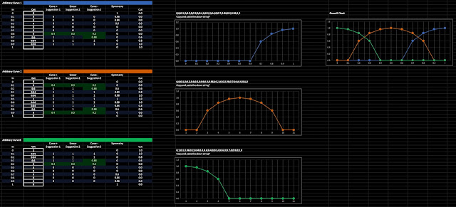
The 'Arbitrary_curve' spreadsheet...

This time there are three sections, which are combined into an overview on the far right hand side. The curves shown are minor variations of the ones shown above, but with a higher degree of resolution - the previous curves were hand coded, whereas Arbitrary_curve makes it much easier to use eleven 0.1 resolution tables, which I wouldn't recommend attempting by hand.

translationTable="0,1;0.33,0.66;0.5;0,0.66,0.0 ;1,0"
translationTable="0,0;0.33,0.66;0.5,1;0.66,0.66;1,0"
translationTable="0,0;0.0 ,0.0 ;0.5,0;0.66,0.66;1,1"

The above is the hand coded, low resolution, linear-approximation version from earlier. Copying and pasting the three tables from the Arbitrary_curve spreadsheet gives this result:

translationTable="0,0;0.1,0;0.2,0;0.3,0;0.4,0;0.5,0;0.6,0;0.7,0.84;0.9,0.96;1,1"
translationTable="0,0;0.1,0;0.2,0.6;0.3,0.84;0.4,0.96;0.5,1;0.6,0.96;0.7,0.6;0.9,0;1,0"
translationTable="0,1;0.1,0.96;0.2,0.84;0.3,0.6;0.4,0;0.5,0;0.6,0;0.7,0;0.9,0;1,0"

As you can see, we have entered the arcane topic of 'obfuscation', the art of hiding things in plain sight. Via detail in this case. Your mind can cope with visualising about five points, but 11 is just too much of a stretch for most people, and the format: pairs of numbers separated by semi-colons, doesn't help. Now if we reformat the pairs:

0,    1
0.1,  0.96
0.2,  0.84
0.3,  0.6
0.4,  0
0.5,  0
0.6,  0
0.7,  0
0.9,  0
1,    0 

Then it is easier to read, and this is how you enter points into Arbitrary_curve.

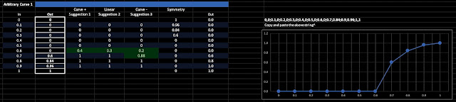
One of the three 'Arbitrary' tables...

This time, there are eleven boxes to fill in. Notice that the 0, 0.1,...0.9, 1 values are fixed, so the input is always between 0 and 1. All you need to do is specify the outputs for each input. From the box, across the the right, are some automated assistance 'suggestions' which may help you to make neater curves. The 'Curve+' suggestion1 column will suggest values to enter in to box on the same row by highlighting numbers in green. if you use these then you will get curves much like the power law-ish ones shown. The next column is 'Linear', and these suggestions will just give you straight lines instead of curves. The next column is 'Curve-', and this suggests numbers that will give log-ish curves. The maths behind these numbers is not sophisticated, and it doesn't work very well at the edges, but it can be useful. In these days of everything being available as a YouTube tutorial, then I'm expecting someone to do one!

The 'Symmetry' column is for Asperger's Syndrome or OCD people, and reverses the list of points so that you can see what to enter to derive combined tables. So I tend to fill in curve 1 and 3 first, then enter the relevant values into curve 2, and so then the symmetry column shows you if you are copying across correctly. 

Spreadsheets are intended for being used by people who like playing with numbers, and often only their creator, so don't expect to be able to use Arbitrary_curve instantly or easily. It may take you a while to get your head around how it works (Power_curve is similar, but it is simpler, and so there's less risk of being overwhelmed!). The basic 'learn as you go' technique is to try making a table on Power_curve, paste it into a table in Decent Sampler, and listen to what it does. Then tweak it, paste again, and listen again. It is a tried and tested method of software development, trust me. Using utility spreadsheets makes it easier to see what you are doing, but the 'copying, pasting, evaluating, adjusting' loop is old and it works. 

Who knows, eventually Decent Sampler may get a purpose built tool that will let you define tables with just a few clicks, and there will be no need for spreadsheets. Until then... 

As it happens, I used the Arbitrary_curve spreadsheet to design the translation tables used in this Pianobook.co.uk virtual instrument:

Utilities

The 'Power_curve' spreadsheet - download

Available in .xlsx and .ods formats, this is good for designing non-linear curves for the low-pass filter cutoff frequency control, and other cases where you want specific detailed control for part of the control's range. It isn't intended for designing sophisticated Translation Tables for doing complex mixing as shown in the second half of this blog post.

The 'Arbitrary_curve' spreadsheet - download

This is also available in .xlsx and .ods formats, and is designed for creating the detailed control curves for volume, etc. This doesn't mean it is amazingly sophisticated - you will have to enter numbers into the boxes, but there are 'automated assistance' suggestions that may make it easier to figure out what those numbers should be... 

---

If you find my writing helpful, informative or entertaining, then please consider visiting this link:

Synthesizerwriter's Store (New 'Modular thinking' designs now available!)

Buy me a coffeeBuy me a coffee (Encourage me to write more posts like this one!)... or...

Buy Me a Coffee at ko-fi.com (Encourage me via a different route entirely...)

Or just tell someone else that there's this amazing blog about hi-tech music...


Friday 15 April 2022

Imitative Sound Design For Synthesizers...

In a recent thread on the VI-Control forum, Alessandro Arcidiaco asked about resources for learning imitative sound design - making the sounds of acoustic instruments by electronic means (synthesizers et al). Here's my (edited) response:

Photo by Karim MANJRA on Unsplash

Most 'how to...' 'synthesizer' articles talk about how to create 'classic' synthesizer sounds, and Gordon Reid's magnum opus 'Synth Secrets' series (in Sound On Sound) covers that in a lot of depth: 

https://www.soundonsound.com/series/synth-secrets-sound-sound 

There are quite a few articles in the series that talk about creating realistic sounds (wind, brass, strings, drums, etc.), often used as an illustration of the uses of specific synthesis techniques. (There are also various books from the end of the 20th Century, assembled from 'Electronic Musician' articles from Jim Aikin, Marc Vail, Craig Anderton et al covering much the same material, again with some coverage of imitative techniques, but I can't recall a specific 'imitative' series... So, my short answer is that I don't know of the 'definitive' answer - but that doesn't mean it doesn't exist!)

https://synthandsoftware.com/author/jimaikin/ (Bio of Jim Aikin)

https://jimaikin.net/ (Jim Aikin's web-site)

http://www.markvail.com/ (Marc Vail's web-site)

https://craiganderton.org/ (Craig Anderton's web-site)

(It is quite interesting to see how a previous generation of 'people who reviewed and wrote about synthesizers' is represented by magazine articles, reviews, books and web-sites, whereas the current  Loopop, Benn Jordan, Starsky Carr, etc. generation are all very active on YouTube...)

You can see this non-specific-ness about imitative synthesis in my 'Practically FM' series (in Sound On Sound magazine many decades ago), which kind of works towards 'imitative', but it tends to show more about how FM can produce synthesised, only-slightly 'imitative' sounds: 

http://www.muzines.co.uk/articles/practically-fm/3527

For techniques where 'imitative' is baked in, then people seem to resort to analogies. This article on Physical modelling quotes me here and there: 

https://theproaudiofiles.com/physical-modeling-synthesis/ 

Which leads to my take on physical modelling: 

https://www.soundonsound.com/techniques/physical-modelling-synthesis-explained 

This is again more about the modelling than the actual synthesis. One very good pointer to the problems of modelling is Yamaha's percussive physical modelling (Karplus-Strong et al) VP-1 synthesizer from 1994 that never made it from prototype to real world - there's an amazing prototype in the Yamaha 'Innovation Road - History of Products' museum in Hamamatsu, Japan... 

https://www.youtube.com/watch?v=3ZXk0pe6KUU

Technics made an amazing physical modelling synth in the mid 90s that you've probably never heard of... (The SX-WSA1 - I reviewed it for Sound On Sound, Mike Metlay reviewed it for the Computer Music Journal)

https://www.soundonsound.com/reviews/technics-sx-wsa1 (my review)

https://www.soundonsound.com/reviews/technics-sx-wsa1r (how to miss a bargain)

https://www.jstor.org/stable/3680833 (From the CMJ - behind a paywall)

(Modern VSTs that use modelling for pianos have seen better success in this space - as with much of technology, timing is vital: too early and the tech/knowledge isn't up to it, too late and the tech/knowledge is available to all... Feel free to do a Google search on 'Piano VST physical modelling'...) 

What is harder to find information on are the more formal, academic, methods. One example would be Residual Synthesis (aka Analysis/Synthesis or A/S), which takes the sound that you want to imitate, and subtracts it from a close imitation to give a 'residual' - the difference between the wanted sound and the synthesized version. That residual is then used as the starting point for a second imitation, and this continues iteratively until you have as close an approximation as you want. The trap here is that it can be very difficult to cope with the changes in timbre from dynamic playing, and it is easy to get bogged down in deconvolution problems that diverge, so there may not be an easy way to create all of the different residuals for different velocities. It's a bit like curve fitting: choose the wrong type of curve and you may be able to fit some of the data, but if you get new data, then you may find that the curve can't be persuaded to fit at all! I did an AES paper on a variant of residual synthesis back in 2018....

https://secure.aes.org/forum/pubs/conferences/?elib=19369 (The AES paywall this time...)

The 'elephant in the room', in my opinion, is that there's an easy escape route, and it started when synthesisers and samplers began to converge with instruments like the Roland D-50: suddenly you had something that produced sounds from hybrid sources: samples (often alarmingly short!) where you needed that characteristic 'fingerprint' for a specific type of sound; and synthesis for when you wanted to augment, enhance, accompany, sustain or alter the sound so that it had a mixture of realistic and synthetic. S&S instruments used these 'Sample & Synthesis' techniques to give huge numbers of presets that passed the 'Mom' test (Would your Mom say that it sounded like what the preset was called?), and layered variations or synthesised sounds on top to give variations. Depending on your viewpoint, these are either hyper-real, or sub-real, but they were easy to produce, and the end of the 20th Century saw huge numbers of boxes with large numbers of presets and lots of sample ROM inside them.

Roland D-50 (My review)

Interview with Ikutaro Kakehashi (My Interview with the head of Roland) 

You can seen how appealing the S&S technique is by considering the E-Mu Proteus, which started out as an enormously successful 'orchestra in a box' (probably one in just about every studio at one time), but which gradually morphed (samples and filters!) over time into providing lots of samples of synthetic sounds, on ROM cards that could be put into slots to create boxes containing vast numbers of sounds (My E-Mu PX7 has all four slots full of 32MB ROMs, for example). 

A quick timeline of E-Mu 1U rack-mounting sample players...

A table of the 32MB ROMs would follow a similar timeline, although not all ROMs got a dedicated player... 

https://www.soundonsound.com/music-business/30-years-emu (E-Mu History)

Yamaha's S&S synthesisers (the current Montage, for example), uses lots of samples to imitate sounds (often layering several variations, and using different samples for different dynamics), but at the same time, has a very powerful FM synthesizer inside which can be used to imitate, augment and enhance the samples. What do you hear a lot of the time from a 'factory/stock' Montage? Samples augmented by other samples... and by FM...

https://europe.yamaha.com/en/products/music_production/synthesizers/montage/features.html

(This is more of an observation about the way that synthesizers are 'voiced' nowadays, and is not a criticism! I really love my Montage 7, and have made quite a few FM patches - a few of which are on SoundMondo...)

Turning synthesis around, and writing a series of articles that start with imitative techniques, is a big task (requiring lots of time, lots of research, and lots of painstaking skill and effort), and the 'Mom' test is fighting you all the way, because S&S instruments (I would count a lot of sample replay devices and sample libraries as being in that set) pass easily, and rather like the 'Uncanny Valley' in making CGI people, it only needs one minor inconsistency for your brain/ears to detect the synthetic nature, and you are back to square one (a 'football commentary on radio' reference, it turns out!)... Getting a real trombone player to listen to a few 'brass' sample libraries can be very illuminating...

https://en.wikipedia.org/wiki/Uncanny_valley (The 'Uncanny Valley'...)

So, you now have a partial view of what I have been doing in electronic music from the early 1970s to the present... This is all my biased, personal opinion based on how I lived through those times. Your opinion can differ, of course...

The 'Mom' Test

Easy! Just ask someone considerably older (wiser, more travelled, more experienced, maybe someone who listens to more Jazz or Classical music...) than yourself to listen to a sound made by your synthesizer, VST, etc. Then ask them what the sound was. If it was called 'PanFlute47b' and they say: 'It is a flute!', then you pass the test. If they say: 'It sounds kind of like a flute type of thing...', then you get a partial pass. If they say: 'Is this another of your synthesizery sounds?', then you fail. 

---

If you find my writing helpful, informative or entertaining, then please consider visiting this link:

Synthesizerwriter's Store (New 'Modular thinking' designs now available!)

Buy me a coffeeBuy me a coffee (Encourage me to write more posts like this one!)... or...

Buy Me a Coffee at ko-fi.com (Encourage me via a different route entirely...)

Or just tell someone else that there's this amazing blog about hi-tech music...


Sunday 10 April 2022

Tuner In A Patchbay!

Please file under: I should have thought of this earlier!

Previously, I have mentioned that I bought a guitar tuning pedal, as well as a Korg TM-60 tuner device to try and improve my embarrassing record of submitting sample libraries that were out of tune to Pianobook.co.uk. Well, some time later, I have realised that the Korg TM-60 tuner works rather well when it is connected to my patchbay! The metronome and tuning reference (A-440 Hz) audio outputs work very nicely as sound sources when developing patches in programmable effects units (Empress Zoia, Poly Effects Beebo, et al), and the monophonic input helps me keep modular devices (my Rebel Technology Witches, for example) in tune. 

I've recently been doing more labelling around the studio, which is why the TM-60 has that 'Mono' label on the audio input (I made a cable with two mono inputs summed by two 15kOhm resistors into a mono output jack just for the patchbay).

The Korg TM-60 in a mobile phone grip on a photo accessory mount...

Yes, you can see a small isolating transformer in the headphone output line - I have more on the outputs of computers that are connected to any audio equipment, and I've been testing out various USB isolators as well... But the Korg tuner doesn't have any USB, so those will have to wait for another day... 

The grip is interesting - it is really a photo accessory designed to hold mobile phones using the 1/4 inch camera screw mount system. The clamp fits onto the standard 37.8mm aluminium tubing that you find on the classic keyboard stands from Jaspers and in my case from Ultimate Support Systems many years ago:

The mobile phone grip and clamp...

The clamp enables the tuner to be placed just about anywhere on a keyboard stand:


The rounded black bit has a rotary tightener that holds two balls in place, so you can position the tuner in just about any position. You can get camera accessories like these from Amazon (and other photographic suppliers) and they are pretty good value for money. Some of the more professional heavy-duty ones might be adaptable for holding small MIDI Controllers, which I will look at in a future post.

---

If you find my writing helpful, informative or entertaining, then please consider visiting this link:

Synthesizerwriter's Store (New 'Modular thinking' designs now available!)

Buy me a coffeeBuy me a coffee (Encourage me to write more posts like this one!)... or...

Buy Me a Coffee at ko-fi.com (Encourage me via a different route entirely...)

Or just tell someone else that there's this amazing blog about hi-tech music...


Thursday 7 April 2022

I got a budget Dual Modulation Effects Pedal!

So, the JOYO Vision Dual Modulation Effects Pedal arrived, and I have been playing with it, quite a lot!

As expected, it does not meet all of my criteria for 'perfection', but sometimes, the immediacy of having lots of 'live' controls can be very useful, and I am very tempted to add an additional 'essential' feature:

- Having real-time control over a number of parameters simultaneously...

Which can be achieved in a number of ways: either directly via rotary controls (as in the Joyo Vision), or via a MIDI Controller.

The JOYO Vision Dual Modulation Effects Pedal

Review

I promised a review of the JOYO Vision, and I'm more than happy to do so. The JOYO web-site provides some information, but Amazon did not expand on that, and there were no detailed reviews, so this will hopefully provide prospective buyers with a bit more detail.

The JOYO Vision (I'm really not sure if the 'JOYO' should be capitalised, or not) is a budget modulation effects pedal, but it has some features which move it upwards towards some much more expensive 'boutique' pedals. This compact pedal is 130 x 110 x 50 mm in size, and weighs a 'not-unusual for a pedal' 425 grams. The power consumption is 170mA from a standard centre negative barrel connector, again not unusual, and not excessive either. There is no mains adapter provided in the box, which is very often the case nowadays, when lots of people put pedals on pedal boards with sophisticated power supply (and audio routing) arrangements. The sampling rate is stated at 44.1 kHz, and the bit resolution 24 bits - I did not hear any glaring aliasing or noise artefacts whilst using it, and I do not have the test equipment to verify these figures. In any case, 44.1/24 is a pretty standard set of audio-to-digital converter specs for a modern budget pedal...

For the price, you could find any number of chorus, phaser or flanger units, but the added flexibility that the Vision offers is very welcome. This is a 'Dual' modulation pedal, with two independent effects processing sections (A and B) that can be connected in series (for complex modulations) or in parallel (for complex stereo images). But it is also a stereo in, stereo out device (or mono in, stereo out, or mono in, mono out), at a price more normally associated with mono in, mono out. You are probably expecting to hear that it is noisy (not particularly so), that the modulation effects were poor (variable would be a better word), and that it is a bit limited and unsophisticated (where you would be wrong). 

The first clue was that audio routing. Dual effects pedals are quite rare, and the ability to have the two effects in either series or parallel gives you two very different end results. Series connected effects gives the complexity of chained effects that blend together as the audio is processed , whilst parallel effects gives complex stereo imaging where the two effects are distinct and separate but mixed together to give the final stereo image. If you are one of those people who finds that most budget chorus pedals lack depth (and stereo connections) and only give limp detuning , then this is a notable exception - especially since you can combine chorus with phasing, or flanging with tremolo, or any of the 9 'A' effects with the 9 'B' effects. 

The two sets of effects are different, in what they do, how they are named, and how they are arranged around the 9-way rotary switch. This feels like a deliberate design decision with the intention of nudging you to trying out unconventional combinations, and it works: I had great fun, both trying to decipher the slightly cryptic and abbreviated names, and then seeing how they worked together. If the two selectors had the same effects at the same positions, then it could easily become a bit 'paint by numbers', but this arrangement almost forces you to try juxtaposing effects. 

For the 'A' effect, the first effect is Mod-Ph, which I interpreted as 'Modulated Phaser', and which seems to be a chorus/vibrato and phaser combined. Next is 'Cho', presumably for 'Chorus', and this was slightly deeper chorus effect, but with no phaser. The ext effect: 'St-Ph', which I assumed meant 'Stereo Phaser' caught me by surprise, because it seems to be a phaser driven by a noise S&H circuit, and so gives some of the 1970s random filter S&H mod feel - not standard in any way, and far from mundane. 'Flanger' was a typical low feedback flange sound.  'Ring-Mod' was obviously Ring Modulation, and this has quite a broad range: about 4 octaves. 'Rot' was the Rotary Speaker emulation, and was rather like the 'Mod-Ph' with less resonance. 'Trem' produced tremolos with the 'Control' rotary varying the waveform from a sine-like smooth to a more choppy square wave - although the two channels were in phase - so this isn't what I would describe as a 'stereo' tremolo because there was no side-to-side stereo panning effect. 'Liqu-Ph' was a smoother (more 'liquid'?) variant of the Stereo Phaser, although the waveform was not random but seemed to be an 8-step sequence - again, more in boutique territory than I was expecting. 'Tri-Cho' was the thickest, most-detuned sounding chorus so far, and the name suggests that three different chorus effects are being used.

The 'B effect starts with 'Opt-Trem' which suggests an Optical Tremolo (bulb and photo-resistor), although it seemed to be a sawtooth waveform and no major stereo effect.  The 'Sm-Cho' seemed to be a smaller version of the Tri-Chorus effect, but still a deeper effect than the Cho(rus) in A. 'Lo-Bit' seemed to be a bit reduction effect, and this was able to add interesting edges to some sounds,  but the 'Control' rotary control didn't seem to do much. 'AutoWah' was a sine wave modulated band-pass filter. 'Anlg Flange' had much more feedback the the 'Flanger' in A. 'Phaser' was a conventional phaser, in contrast to the three unusual ones in A. 'Octa' seemed to be another ring modulator, although with a smaller oscillator range - about one octave, and so dropping the input frequency by one octave. Having two ring modulators on a pedal is quite unusual, and if it had been me designing this, at least one of them would have been modulated by an LFO... 'Stut' is for 'Stutter: a chopper effect that always has a square wave this time. Finally, there was 'Vib' which gave a vibrato effect.

If you were counting, that's 18 different modulation effects. Note that this doesn't cover all of the effects in the table in the previous blog post...

There's a slight 'click' as you switch the effects in and out, which is not that unusual for budget pedals, but you can use the Mix rotary control to avoid switching the effect in and out, which means there are no clicks! The flanger effects in A and B are both slightly prone to the buzzing sound from any mains pick-up in cabling, which I have used as a way of checking for ground loops, showing the advantages of balanced connections, and other 'studio-optimisations' many times... As in many pedals, both budget AND boutique, for some of the effects, there's sometimes a difference in volume between the dry 'through' audio and the wet  'processed' audio. For the cost of a look-up table and an extra couple of multiplies in the code, then I'm surprised that this persistent niggle still exists. 

If I was being picky, then top of my wish-list for additions would be an expression pedal input... But this just raises the importance of looking more throughly into a mechanical linkage version...  a homebrew 'third hand' (The original TIP 'Third Hand' hasn't been made for several years, apparently...). It is on my list of projects...

One thing that I did notice, and which might be seized upon by some people as proof of the budget nature of this pedal, was the lack of much stereo imaging in most of the effects. Even so, having Trem on A in parallel with Vib on B, did give a very independent LFO Tremolo/Vibrato effect that worked very nicely with a little external reverb, and sounded very wow and fluttery at times. There's more to designing a stereo version of an effects pedal than just doubling up on the circuitry, and although there's no obvious way of updating the DSP code, I suspect that a few minor changes are all that is required to produce a marked improvement. I should point out that I'm slightly notorious for creating mastering problems by being overly enthusiastic about broad stereo, so I'm on the extreme side of good taste in terms of stereo imaging in effects pedals. 

But back to the real joy (no pun intended, really) of this dual modulation effects pedal - having two different things happening at once, either in series (complexity) or in parallel (slight stereo wobbling) is so much nicer and more sophisticated than a mono chorus pedal which just sweeps back and forth (in mono!) monotonously. With every combination of A and B offering two different rates of LFOs (I forgot to mention that they both have independent tap-tempos on the two foot-switches!), then you get a much more interesting modulation, which is exactly what I want in an effects pedal! Given the flexibility of effects combinations in the JOYO Vision, then I would be hard pressed to justify going for a similar priced but less varied mono alternative. And stereo in and out is a bonus, although I can't help thinking 'if only' for just a little bit more pan-breadth. (Now, there's a word: pan-breadth! I will see if I can work that in more often!)

Improvements

That probably set you thinking that I was about to suggest ways in which it could be improved, and I have to say that the stereo imaging was the only internal weakness I found. Oh, and the slight clicks when enabling the effects with the foot-switches (although there is a workaround with the Mix rotary controls).

An 'angled' viewpoint - note the right hand side readability

Externally, there was the strange arrangement of the Speed/Rate and Depth rotary controls for A and B, which didn't match the mirroring of the rest of the controls, but that is being picky. Perhaps best described as a 'quirky' arrangement, then. 

But the thing that I found most irking was the colour scheme! The background colour of the case is a metallic brown colour, which goes lighter when the light catches it. Unfortunately, the text is printed in an orange/yellow colour, and so it tends to vanish when the light catches the background colour. at the wrong angle, which seems to be too often... Yellowy-orange on yellowy-orangey/brown is not a good combination for easy readability... You can see the difficulty of reading in the photo at the start of this blog, but the other angled shots show very clearly how the background colour changes depending on the lighting... 

The opposite angle...

So I made two little sticky labels (see my Roland TR-505 mods post), printed them out and stuck them to the top panel, giving high contrast, stage-use-friendly, easily readable labels! 

The prototype 'Labelled' Vision...

You can find the graphics files here, and feel free to print it out and make your own labels - as below. I have recently found a source of matt-finish clear sticky-back plastic, and this makes much better looking custom labels! 

The 'Improved' front panel rotary selector graphics...

Rather than putting 'commercial printing'-style cutting marks just at the corners, I have added light grey outline boxes - because I suspect that anyone who uses these labels will be cutting them out with scissors or a scalpel. For maximum flexibility I have also added marks in the file, as well as providing an 'inverted' version with white text on a black background (and brown/yellow too!). 

This set me thinking - is there any interest in additional 'Improved' front panels for electronic music devices? I know there are skins for lots of things, but I'm thinking more UI improvements rather than just appearance.

Oh, and one extra 'feature' deserves mention - there are extra blue LEDs inside the pedal, which light up two translucent plastic inserts and make the pedal look very sci-fi and hi-tech. Very cool! (You can see a photo in the previous 'Dual Mod' blog post...

Conclusion

Starting out with a quest for a dual modulation effects pedal with a distinctly 'boutique' flavour, and buying a dual pedal from the budget end of the market may seem strange, but I'm rather delighted with the JOYO Vision. It doesn't have USB or MIDI, and is not perfect (or expensive!) but those 'live' rotary controls, stereo I/O, and the 'different' set of effects make this an interesting tool for sound design and 'What effect is that?' kudos on stage or at practice sessions. Plus, you could easily pay several times the price and end up with something far less flexible, which is always good in my book! I can definitely see myself sprinkling a little bit of Vision here and there... 

The Zoom... 

I'm still waiting for delivery of the Zoom MultiStomp pedal, and it will be interesting to compare it with the JOYO Vision (which is still cheaper than the Zoom). Will the immediacy of 'live' rotary controls beat several effects at once? We will see...

Resources:

The Roland TR-505 Mods blog post...

JOYO's web-site page for the Vision

The previous 'Dual Mod' blog post...

The graphics files for the labels...

---

If you find my writing helpful, informative or entertaining, then please consider visiting this link:

Synthesizerwriter's Store (New 'Modular thinking' designs now available!)

Buy me a coffeeBuy me a coffee (Encourage me to write more posts like this one!)... or...

Buy Me a Coffee at ko-fi.com (Encourage me via a different route entirely...)

Or just tell someone else that there's this amazing blog about hi-tech music...